
A Russian fan recently directed me to this site, which gives a full accounting of books by my Russian alter-ego, Скотт ВеÑтерфельд. (Technically, Скотт is not an alter-ego, given that he is, in fact, me. But I prefer to imagine him as an actual other person, reading this post and chuckling as he consumes champagne and caviar, surrounded by all the author’s copies that my Russian publishers never bother to send me.)
I’ve always enjoyed Скотт’s covers, which have a pulpish fabulosity that makes my own covers seem restrained, almost priggish, in comparison. So I thought a series of posts examining his work would be fun.
Let’s look first at Скотт’s Midnighters series. These books have had no fewer than three separate sets of covers. Whether this is because Скотт is astonishingly popular or simply because this series has never gained traction, I have no idea. (Someone would have to send me some royalty statements in order for me to take a guess. Hint, hint.)
Anyway, here are the first two Midnighters covers, published in 2006:

These covers are fairly true to the books in their details (13-pointed stars, small-town buildings, all sort of metal weaponry) but the central figures are somewhat bizarre. First note that Jonathan Martinez (um, Hispanic) and Jessica Day (textually a red head) are both blond and blue-eyed here. That’s whitewashing in its most aggressive form—Aryanization.
Also odd is the subway train looming up behind Dess in Book 2. Note to Russian artist: there are no subways in Bixby, Oklahoma. The stimulus bill wasn’t that big.
But it turns out that these covers have been replaced, so let’s move on. This is what they looked like in 2008:

Holy guacamole, that’s a different look. The whitewashing is pretty much over with Jonathan, and Jess has arguably reddish hair. Of course, everyone is suddenly in bondage leather, which might not be strictly canonical (or even purchasable in small-town Oklahoma). But the energy in these covers is lovely.
I also like that Dess is on Book 1, while Jessica and Jonathan have been moved to Book 2. Because everyone likes Dess better. Plus, this Dess is much more awesome than wimpy oop-I-fell-over Dess from the first set of covers.
But this take on the series didn’t last either. A little book called Сумерки came out, which was about some dude who sparkled, and there was a sudden call for everything to look a bit more . . . vampire-y.
So these are the books in their current form:

A little more urban fantasy, and apparently a bit more successful, given that we finally have a cover for Book 3 in this style:

So . . . Buffy. And yes, Jonathan has been white-washed again, but without blond hair at least.
It’s worth noting that these three covers have the least to do with the books. The 2006 and 2008 covers could be stared at after reading the books, and you’d find lots of little easter eggy details from the text. These are more generic.
Which brings me to a broader point: Everyone in marketing says that the most important thing a cover can do is sell the book to someone who knows nothing about the novel. In other words, a cover is merely advertising space, and doesn’t need to be true to the text, just eye-catching. But this notion misses what happens over the longer term.
If we readers can return to the cover after we’ve bought and consumed the novel and find new connections between word and image, it strengthens our bond with the book and the series as a whole. And the most important advertising for any novel is, after all, a satisfied reader. I wish publishers would get over the whole first-impression thing and think harder about long-term relationships. (Indeed, it would probably be nice if everyone would do this about almost everything. But that’s a bigger issue.)
In other words, I like the second set of covers best, pulp-tastic and yet mostly true to the story, and full of details from the text. Midnighters is, after all, more about kicking darkling ass than sparkly romance.
One day, my Russian publishers may send me royalty statements, and I can tell you whether or not this theory is full of bosh.
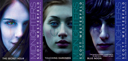
And for those of you who don’t know the Midnighters series, here are the current US covers:
I’ll be blogging the Russian Peeps, Uglies, and other covers soon. There are also a new set of UK covers for Midnighters in the works, and I’ll be touching on those as well.
Till then, enjoy.
First to comment! I liked the the original US covers more than the current ones.
Oooh. Awesome covers. haha. I think I agree with you, Scott the second covers are the best they really seem to represent the books well and they look really cool.
New UK covers?
Okay now I’m really excited. Every time a book comes out with a new cover I get psyched. This should be good. haha.
Thanks for posting this. 🙂
-Mel
The US covers have always, in all their forms, been the best to me.
The Russian ones…
Well, I know you’re not supposed to judge a book by its cover and I would have missed out on one of my favorite series of all, but I wouldn;t have read them. 😛
This was very cool, though.
Thanks for posting.
From the darkliest little darkling,
Chermauth
The current U.S. covers are pretty cool. I like them better than the Russian ones. The books I read had boring covers where you couldn’t distinguish the faces of the characters whichh sk, though all five of them werein the covers.
It’s really interesting getting to see how the covers are represented in other countries. But darn Twilight! >.< Always ruining EVERYTHING, as usual.
i really dig the STYLE of the first set of covers- they remind me of old school sci-fi but the 2nd set is much truer to the story…
the US ones are pretty sweet but i think i’m attached to the older ones … usually i end up using book covers as a foundation of the character’s appearance then go from there.
needless to say when i saw the first covers a big question mark formed over my head – who ARE these people?
lol but i guess that’s the beauty of lit- everybody ends up looking differently to each mind.
love to the Westerlies
and thanks Scott for posting the covers… fun to see <3!
I agree with DragonRose: I like the other US covers better than the current ones. That may be because the copy I read had those covers, and I am attached to them, but still. I also like it when there aren’t characters on the front, so that you can imagine them. Illustrated ones are okay, I guess, but definitely not actual peoples.
Thanks for the fun post, Scott-la!
Oh man, I jut went to the site and the Peeps/Last days covers are dreadful.
I’ve never picked up the Midnighters, since I always perceived them as being more Middle-Grade. However, of the covers above, the 2nd ones (with the leather) would definitely make me pick them up, and are my favorite. The first ones are too young-looking, and the third ones are all sexed up…So ya.
Yeah, pulpy is definitely the word for it…
If the characters were anywhere near accurate, I’d say I liked the first set best, or at least the Secret Hour cover of that set, because I love all the actual details of the town and the 13-pointed stars and all. The other two sets skew very adult urban fantasy to me, because Midnighters may be a series about kicking darkling ass, but it’s in a very faily small town high school outcast way, not 20-something bondage leather way. Actually, by that definition the Buffy cover sounds a lot more accurate, but… no. No, thanks.
I do like the current US ones quite a lot (which is why I have two complete sets of the series…) for use of the symbols and at least kind of resembling the characters.
I do like the old US covers quite a bit too, though, but I really have never been able to figure out the group on the back of those: WHERE ARE THE GIRLS? I mean, there are five blurry people, and one of the second-closest is definitely female, and maybe the farthest away is too, but that still leaves one guy too many, and I can’t figure out which/if one of the other three is supposed to be another very-short-haired girl. I mean c’mon. The girls outnumber the guys in the group. There should be more than one clearly female figure.
…yes, this has bothered me for years. Damn blurry silhouettes.
I’ll always love the frozen raindrops on the front of the original Secret Hour, though. So much eerie blue.
That is definitely Spike on the last cover! Or his twin brother. And he’s white as anything!
I love cover posts!
It’s really fun to see the different covers in other countries. However, I think I like the covers from the books I read. (I don’t know if they are the originals? Maybe someone can tell me…)
http://3.bp.blogspot.com/_-woJV62rwZs/SwkGcTnKiBI/AAAAAAAAAd0/fnkMofWJ8aY/s1600/MidnightersBlueNoon.jpg
Hopefully the link will work…
Anyway, I just think these are way cool. With the colors and the characters. It doesn’t look too fantasy and it doesn’t look too sexed up.
The UK covers for midnighters suck, really. 🙁 I miss my US versions!
those covers are awsome!!!!!!!
I’ve been trying to sell myself on the whole ‘it’s just for advertising’ role for the cover and you have totally just summed up why that argument doesn’t entirely wash.
The long term relationship of a reader to a book (and series, and author) is so important – and in many cases could be the difference between someone buying a copy for themselves, or reading it from the library. I have a friend who will borrow books & then buy her own – but only if she loves the cover.
Loyal readers don’t just buy a book and have done with it. They buy books as gifts, they replace old and beloved copies, and they talk excitedly about books they love.
‘Wrong’ covers bug me years after the fact. Awesome, ‘right’ covers are like a reward to the reader.
I read the Midnighters ages ago and I believe the covers were varied (from Library). I like the Russian covers and I don’t think they whitewashed Jonathan at all in the last set. He looks Euro, not particularly Spanish, but I don’t get that caucasian vibe. I know many people with Spanish/Hispanic last names and you wouldn’t even know they were Spanish/Hispanic.
I really enjoy all of these covers, despite the mistakes you’ve pointed out (the ones that, you know, seem like the makers didn’t even read the book, have any idea where the characters were or how they looked), haha.
But I have to say, Jessica on the front cover of the US Midnighters makes her look like a creeper to me. It’s the weird half smile and her hair covering her face – it reminds me of my very first “drawings” back in 6th grade, where I had to draw the hair in front of my character’s faces because they always lacked symmetry if I didn’t.
Aaaaat any rate, the US ones seem to capture the character appearances best…but seriously, Jess, stop looking like such a freaking creeper.
Also, hahahahha, I just got the Twilight reference. I must’ve skimmed before.
It’s a damn shame, too, because I’ve had two great ideas for books, and both of them revolve around vampires. Maybe I’ll go through with the second one – a book about a young girl who fell to the Black Plague and was bitten and transformed into a Vampire, and now lives in current-day as a secret from the world, so a book from a Vampires POV but with some wit involved – because I think that, no matter what, here on out, everyone will compare a vampire book to Twilight. So, dammit, I’m going to try to do something creative, if it’s not original.
Is anyone else receiving an error link when they click on the word “Midnighters” in the 3rd paragraph?
Hmmm… I wonder if I’m the only one who’s getting this.
Melissa-wa : I just tried the link and I got through. This is where it takes you:
http://scottwesterfeld.com/midnighters/index.htm
I think it’s a good idea for covers to accurately represent some aspect of the book because it should give you a better idea of whether you’d like it than a book with a more generic cover. Being able to look at a cover afterwards and know what scene it’s from it awesome, though.
I’m happy they’re putting out new UK covers. I don’t really like them, except for the spines forming a clockface when they’re all put together. the covers are all the same picture on a different colour, it’s kinda boring.
Oh, very cool Russian covers. I like them a lot, and because I am from Russia, I have everything they have. I’m proud of it)
great point, focus on the cover (message) will strengthen the emotional connection to the brand.
still find it strange how marketing and book covers have so much weight in whether a book is successful or not.
look at all the ‘twilight’ look alikes in the best seller section of your local mega book shop – most of those covers have nothing to do with what’s inside.
i really like (and own) the US version of Midnighters and did find upon finishing the books how much i liked these covers because they belonged to the story without blatantly giving it away or promising something that is not inside.
and i like that these covers left space for my own imagination to take the story with me and make it mean more.
strange how we need the visual que to provide for a media which is really only visual in your own imagination??
book covers are sort of like a promise and not all of them are true
Very cool post, Scott. I’ve used that particular website to research Russian editions of Andre Norton books.
Something you wrote above raised a question I’ve wondered about. You wrote “Someone would have to send me some royalty statements in order for me to take a guess. Hint, hint.” So are these authorized editions, are are they essentially pirated copies that you will never be paid for? I’ve wondered that about Andre Norton as well. Of course, she’s dead now, but I’m assuming royalties should still be paid to her estate; also assuming that they ever had been.
Just curious.
oh, joy.
i just went to the site… and the peeps/last days/uglies/pretties covers were horrid!
seriously, don’t even look. if the american covers looked like THAT, i never would have read any of these books!
Oh my! I almost forgot how completotallyawesome the US covers are. I think i am in love with the third book and want to look like the first.
Awsome!!!!!! 😀
i liked the oiginal US covers. they were….more mysterious than the new ones, and better conveyed the pure awesomeness that is Midnighters. <3 Dess ftw.
ROFL! “Kicking darkling a**” Can’t wait for the Uglies covers. 😀
whoa.. ha even tho so many westerlies said to not look at the other covers…. i did! i swear i have no idea what is going on with the last days one.. it’s like blue lagoon meets simone.
bleh
but i will say this the uglies cover has a AMAZING hoverboard on it..
I own the first-set US covers, and I think I like those types the best. Fun little details, and they don’t SHOW you the characters. Maybe that appeals to some people, but I usually like getting to imagine what they look like. If there is a person on the cover of a book I read, I’m going to imagine the character looking like that – even if that character is a textual redhead and a cover blonde.
By the way, I love the little blurb about your alter ego XD.
You’re hilarious!
“A little book called Сумерки came out, which was about some dude who sparkled, and there was a sudden call for everything to look a bit more . . . vampire-y”.
Does anyone else get it?
Me and My Spagbol: I get it! i love how he says it was about “some dude who sparkled”.
Скотт ВеÑтерфельд has great covers.
I like the US Midnighters covers too…
I like the alter ego blurb too! 😉
Darned Twilight for turning everything vampire-ish… it’s an okay book, but honestly… Sparkles?
Anyway, love the covers!
I definitely still like the original US covers over the new US covers. But I’ve known them for what, six years now? And Midnighters was my first Scott series, so it always has a special place in my heart. I wish there wasn’t so much whitewashing in the first set of the Russian covers, because I really love all the details.
I’ve had a great time watching how covers for teen fiction have changed after the popularity of Twilight. So many covers these days follow the same aesthetic principals, and it’s just glaringly obvious. I wish publishers thought better of teens.
Ping to the people: Okay, this is definitely off subject, but this story from school today is just so random I just have to share it! You guys know how the popular people talk right? They talk like… I think the term is “California Girl?” well, anyway there’s this girl who does our morning announcements who has it bad. A line came up that advertised some manga and anime club at the public library.
she TOTALLY mispronounced anime.
The way she said it it sounded like “Ah-NEE-me.” ha!
I don’t know why, but it just killed me. I burst out laughing when I heard it.
OKAY PEOPLE IT’S PRONOUNCED AN_UH_MAY!!!
REMEMBER THAT WHEN YOU COME ACROSS IT!!!
Kay, hope you enjoyed my short story.
Speaking of dudes who sparkle, the vampire lady’s coming out with a new one.
Here’s the link: http://www.breetanner.com/
Going outside! See ya! 😀
ooo, this is tres interesting. iLike!
the first covers i woudn’t have picked up coz they look boring, the 2nd i would hve been scared off, but i kind of like the third, or at least the first book of them anyway.
i def like the older US covers better- the’re icy. But like someone mentioned, there are only 2 girls!!! its also always annoyed me…
Speaking of covers…
Today I was at the used book store and saw a copy of the UK version of Peeps! I nearly bought it… but I’m running out of room on my bookshelves and I’m saving up for a turntable.
Just looked at the russian uglies covers, (yeah yeah not supposed to, whatevs.) There’s no change in Russian Tally’s looks whatsoever! What’s up with that? Maybe I should go compare the two some more… 😀
not that this has anything to do with those AWESOME book covers but is mind rain part of the uglies series???
OMG I LOVE THE PIC OF DESS IN THE FIRST SET!!!! i mean, *coughs* it looks sooo realistic!
Ping to The other tally, comment 37:
I think the term is Valley girl, sometimes pronouned balley girl.
wuts mind rain??????
СКОТТ! Ñ Ñ‚Ð°Ðº рада, что Ñ‚Ñ‹ напиÑал о наÑ, о РоÑÑии! у Ð¼ÐµÐ½Ñ Ð±Ñ‹Ð» такой воÑторг, что Ñ‚Ñ‹ нами заинтереÑовалÑÑ! приезжай к нам, Ñ Ð±ÑƒÐ´Ñƒ очень рада! у Ð¼ÐµÐ½Ñ Ñ‚Ñ€ÐµÑ‚Ð¸Ð¹ вид книг, мне нравитÑÑ Ð±Ð¾Ð»ÑŒÑˆÐµ, чем ÐмериканÑкие.
Люблююю
SCOTT! im so glad that you have written about us! i was so exited that you had interested about us! Come to us, id be very glad! i have got the 3rd Midnighters cover, i like it more than the US cover
Love youuu
yes, i speak english so bad
who can help me?:)
PFfffft, some dude who sparkled… so true. The third set is definitely like all pale and vampire-y and seemingly high-on-drugs-ish. I like the first set and the second set because the art is simply beautiful. It would have caught MY eye.
I was just perusing old(er) blog posts and came across this. I am in the truest sense of the word a Russo-American, so this was really exciting. And, I have to say, I much prefer the American covers of all the series. The cover for Uglies was cool, but I don’t know, maybe I’m just biased. It certainly portrayed a very futuristic background, and I did like the hoverboard, but it was so busy compared to the American cover.
And the Сумерки comment made me laugh loudly enough to wake my dog up 🙂 Very nice. I’ve only recently stumbled across your site, but I’ve been a big fan for several years 🙂
i like the original cover that just had blurry silhouettes of everyone. i enjoyed the series and hate it when covers have ‘real’ people on them cuz they never look like the people i imagined from the book. the current russian cover looks too much like a CW tv series ad or something
I loved these books so much. I wish there was a volume 4 coming out. These books left me on my seat everytime a chapter ended. They were full of excitment.
По моему потрÑÑающие обложки, как не крути, пуÑкай и Ñ Ð½ÐµÐ´Ð¾Ñ‡ÐµÑ‚Ð°Ð¼Ð¸!
Ðу и Ñ Ð±Ñ‹Ð»Ð° бы очень рада еÑли бы Ñ Ñерии “Uglies” поÑвилаÑÑŒ Ñ‚Ñ€ÐµÑ‚ÑŒÑ Ð¾Ð±Ð»Ð¾Ð¶ÐºÐ°, вмеÑте >.<
The girl on the US touching darkness cover looks like regina spektor. weird.
I soo want that shirt! That’s so cool. I LOVE the Uglies trilogy, and I’m a HUGE Midnighter fanugg infant erin boots
ugg classic cardy boots, so thanks so much for the shirt template.
Great ideas, props to you for making the effort to think of it