
While working on Specials today, I was poking around in my Uglies folder and discovered this pairing:
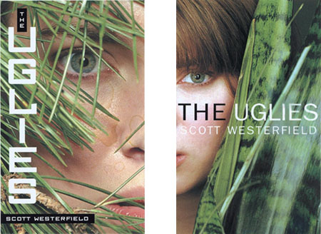
These were the two covers first given to me by Simon and Schuster, who were good enough to ask my opinion. Like design departments everywhere, the artists misspelled my name, and also managed to get the title wrong. (It’s Uglies, people, not The Uglies.) And let’s not mention the coffee stains.
They’re both really good designs, though. But Justine and I, and everyone else we showed them to, prefered the one on the right. More importantly, S&S agreed, and used that as the basis for the final cover.
So why is it better?
Well, first the leftmost design: The expression is much more intense, like someone secretly watching a terrifying ritual unfold. The lines of grass across the face create a more interesting composition. On the other hand, I don’t like the squarish font of the title as much. And I don’t like the black boxes around my name, which remind me of those machines that insane people use to make sticky labels to put on everything. In trying to make the text readable, the cover winds up with one too many design features.
The one on the right succeeds by being simpler, more direct. Although the eye is smaller, its gaze isn’t muddled up by the foliage. The rounded sans-serif font (without sticky label backing) helps simplify, intensify, and focus the cover. (I also like the black/white treatment of the title, except that it wasn’t the title.) Instead of the terror of the rejected cover, we have something intimate and quietly intriguing.
So simple seems better to me. And I’m glad the final cover zoomed in even closer to the model’s face.

But what the hell do I know? I’m, like, a writer. What do you guys think?
I’m sorry for asking this question when it has nothing to do with the uglies series. But will there be more Midnighter books after Blue Noon?
I definitely prefer the cover on the right. I will admit that it’s mostly the font on the left cover that repels me.
I concur – the square font is rather off-putting.
You picked the correct one. The one on the left is trying too hard.
The one on the left is not only not as attractive, it’s coffee-stained. You definitely make the right choice.
I agree, like everyone else, with your choice. The font on the right one is so weird, especially compared to the other font and it looks weird with the picture. Yeah, and the picture does look like it may be trying to hard. I like the intense look on her face, but overall, the right one is better, and it makes simplicity look like the right way to go.
The one on the right is definitely better. It’s much more clean and simple. and the sans-serif font appeals more to my eye. I find the one on the left too distracting with the grass. I’m not fond of the squarish font either.
I just came to this site yesterday and I find it extremley strange and interesting that you manage this site. Most other author’s sites, I assume, are run by other people because they’re written in third person. And you even blog! Haven’t seen any other authors doing that either. Do you actually do all the HTML/Java for the site?
Actually, Rashmi, I got here via another writer’s blog (one John Scalzi to be exact.) and Neil Gaiman runs a blog too. These are just off the top of my head. I’m sure there are a bunch more.
I’m going to jump on the right-cover bandwagon, too. The left one isn’t bad, but it’s too intense. What were they thinking with that font, though? (It’s a small thing, but I think the plant of choice there is pine and not grass.)
Yes, down with square fonts! (And coffee stains.)
will there be more Midnighter books after Blue Noon?
I just had a meeting with Harper about this, and all I can say is that there are discussions. But I definitely want to take a year off. Blue Noon ends with a bang, and bangs should have a moment of silence after them.
And you even blog! Haven’t seen any other authors doing that either.
I don’t know about them lit’rary types, but lots of sf and YA authors blog: Charlie Stross, Ellen Kushner, Margo Lanagan, Holly Black, Nalo Hopkinson. And, of course, my wife Justine Larbalestier. And many more. Maybe it’s because we need that one extra excuse not to work on the real stuff.
Do you actually do all the HTML/Java for the site?
No. Justine is my webmistress, and the base-level coding (especially for the Midnighters part of the site) was done by the excellent Deb Biancotti. But I did do the site design and graphic. (I used to design children’s software for McGraw-Hill, back in ancient days when CD-ROMs were cool.)
Anyway, thanks to you all for agreeing with me about the cover. It certainly seemed like a difficult choice at the time (not that it was entirely my decision). But in retrospect, the left one does seem like the obvious choice, especially now that it’s staring at me from all those author’s copies on my shelf.
At this point I should publicly thank Rodrigo Corral, who did the design in the first place. I can’t say how much Uglies fan mail I’ve gotten that started with, “I just picked up your book because of the cover . . . ”
Yay, impulse buys!
I know you probaly wont give me an answer of this, because it could possible spoil Blue Noon but I’m going to ask anyway. Does anybody die?
And are the Darklings destroyed? and a new threat arises that the Midnighters have to fight?
*shakes finger* Your not suppossed to ask that kind of stuff! Shame! I also will go with the right cover, although I can’t really add in anything since it’s already all been said. I must say that the coffee stains add a charming mottled look to the model. Very attractive. You simply MUST spill coffee on all the other covers aswell. I can’t wait for Pretties to come out!!!!!!!!!!!! It’s driving me nuts! I think that the whole theory of being “perfect” makes the book so appealing to our appearence-obbsessed world.
I know you probaly wont give me an answer of this, because it could possible spoil Blue Noon but I’m going to ask anyway. Does anybody die? And are the Darklings destroyed? and a new threat arises that the Midnighters have to fight?
Asking for spoilers! How could you? Let me only say that I thought long and hard about whether to kill anyone or not, and, if so, who.
Long and hard.
You chose the right one the one on the left seems like it’s hiding from someone, and it looks as if it’s been running all day and is exauhsted.
The right one is definately nicer. (and the color changes in the final cover are even cooler ) It never occured to me that you may kill someone off in the next midnighters….now the wait seems even more painful!