Pretties Week Begins!

Pretties comes out on November 1, just over a week away, so it’s time to begin the celebrations!

For those of you who don’t know, Uglies and Pretties are set in a world in which cosmetic surgery is not optional. The society has lots of theories about what makes a face the right kind of pretty, and this week I’ll be discussing the science behind those theories.

So let’s start with . . . face averaging!

One of the ways scientists generate fake pretty faces is to visually average the general population. Basically, you stick a lot of pictures of faces into a computerized blender and morph the results together. See how the third face is pleasanter to look at than the first two?

It is believed that averaged faces tend to be more attractive because it’s good to have a wide variety of genes from across the local population. People with a wider set of ancestors are (by definition) less in-bred, which means they’ll have more disease resistance and other neat superpowers like that. So we’ve evolved to think that people with genetically average faces are good mating material.

So how do we know what’s average? Answer: By looking around at the people where we live.

The faces above are from a German University, which is why they’re white. In a recent University of Western Australia study, however, researchers found that in a mixed-race society, the faces considered most attractive have mixed racial characteristics.

Australia’s population is composed mostly of Asians and Europeans, so when reporting the study the Sydney Morning Herald chose a model with Scottish, Spanish, Phillipine, and other Asian ancestry to make their point:

A definite hottie. Of course, the US version would have more African ancestry and probably more Latin American in the mix as well.

Anyway, averaging faces is only one technique that the Pretty Committee in Uglies uses to create beauty. And of course in the real world, we find all kinds of extremes attractive, as well as personality, accomplishments, and shared personal history. We’re just talking about statistics here, not individual preferences.

For me, averaging (especially by computer) often leads to a bland beauty. Like, say, these two faces composed of 64 Germans each:

Generic + Vaguely Creepy = Yawn

Uglies in the United Kingdom

Just got this from Simon & Schuster, a treatment for the cover of Uglies in the United Kingdom:

A really different look from the US cover, but I love it! It has a much creepier feel, because of the surgical pan. (Well, and the body parts, too.) I give it the simple-but-effective award.

Plus, the color scheme is cool. (Or is that a “colour” scheme?)

I don’t think it comes out there until April 2006. Because, you know, they have to translate it into English.

Specials DONE! (Pretties coming!)

Well, I’m off to Mexico tomorrow. I may photoblog from San Miguel a bit, but I’ll mostly be working.

So before I go, here’s my big news: This morning I sent off the finished first draft of Specials, the third book in the Uglies series. There are rewrites and edits to be done, but I’m basically done with the trilogy. Yee-hah!

Wait? Book three! Well, to answer once more the most common question in my fan mail, Pretties, book two, comes out in less than two months!

I know, crazy isn’t it? I’m a whole book ahead of my publishers. But that’s the way it goes. The text has to be edited, reviewers’ copies have be sent out, marketing campaigns planned, and that’s before book stores fill out their order forms. Justine explains it here.

Watch this space for the cover of Specials, which I’ve been promised is coming my way soon.

In the meantime, I’m off to Mexico to relax, recreate, and start on my next book, which may (or may not) be a sequel to Peeps.

Hoverboard Vistas

Sorry I haven’t been posting much. Specials is due next Tuesday, and I’ve been writing at a screaming pace. But the fact that I was in Uglies visualization mode made the following un-not-point-outable.

Those of you who’ve read Uglies may remember the roller coaster scene on pages 63-5. It’s all about how kids who ride hoverboards (personal flyers halfway in size between surf- and skateboards) use the rusting metal in an ancient roller coaster to assist their magnetic levitation to new heights.

If that sounds hard to visualize, dont’ worry. I just came across this Photoshopped image in a Fark contest on the subject of theme park fantasies, and am happy to see that somebody shares my insane hoverboard/rollercoaster vision.

For the rest of the images, click here.

Regular Blog Day!

Okay, I really don’t have very much to write about today.

After getting Boingled, though, my hit rate was sky high, and it’s drying up faster than a dead dog on a Texas highway. I just can’t stand to see all those readers slip away. So I’ll use the time-tested strategy of so many regular blogs, and tell you random crap about my week:

Random Thing 1: Today I wrote almost 2,000 words of Specials (Book 3 of Uglies). That’s an excellent day’s work, which is what I’ll have to manage from now until September 12, when it’s due. I think they were good words, but I never know until the next day. Plus, there will need to be an action scene soon. Or perhaps a hoverboard chase.

Random Thing 2: On September 13, Justine and I are headed to Mexico for a month. It’s a writing holiday for her to start on the third Magic or Madness book and me on a possible sequel to Peeps. I can’t wait to show you pictures of San Miguel.

Random Thing 3: The night before last we went to a party hosted by our friend Lauren Cerand, and the blogtastic Maud Newton was in attandence. It was tons of fun, although yesterday was spent with bodacious hangover.

Okay, that’s enough of this. Next time, a real post. But first, since we’re being a regular blog today, a cat picture:


This is Millhouse, who came with an apartment we borrowed in Buenos Aires. He is named after the Simpsons character, and made us love him with his quiet wisdom and impeccable comic timing.

Hunting the Snark (updated!)

Whenever I see my writer friends react to reviews, I’m reminded of a certain Gary Larson cartoon:

Owner says to dog: “Get the stick, Rusty! Come on, get the stick! Good dog, Rusty! Isn’t Rusty a good boy!”

Dog hears: ” – – – – – Rusty! – – – – – – – – – – Rusty! – – – – Rusty! – – -.”

But it’s not our names that we writers get all hyper-aware about in reviews. It’s the snark.

Here’s an example: I once wrote to congratulate a friend of mine whose new novel had just received a fabulous, glowing review in Publisher’s Weekly. She wrote me back a one-word email: “Overwrought?!?!?!”

Oops. I hadn’t noticed that one bit of snark among all the praise. I had read the following words, “This extraordinary and accomplished novel, while overwrought in places, is hands-down one of the best books written this year, maybe of all time!” But my friend had seen only, “- – – – – – – – – overwrought – – – -!”

This Rusty-dog-like vision is why when writers see emails from their publishers with the subject header KIRKUS REVIEW, we flinch a bit. Okay, we flinch a lot. Kirkus must have some sort of snark-inclusion rule in their guidelines, and their anonymous reviewers follow this rule with relish. Even in their most positive reviews, there is always at least one damn phrase guaranteed to gets up the author’s nose.

Being as Rusty-dog-like as the next writer, I remember exactly two words from the Kirkus School Library Journal review of Uglies: “although lengthy.” (Gads. It’s that “although” that kills me. Like “lengthy” things are such a trial. “Although lengthy, my vacation was very enjoyable.” “Although lengthy, our marriage is a true union of two souls.” “Although lengthy, World War II defeated facism and saved democracy.” Argh.)

So when my upcoming Kirkus review of Peeps appeared in my in-box, I braced myself. (Plot purists take note, mild spoilers.)
 
(STARRED) Both medical thriller and science fiction, this fast-paced, captivating modern vampire story is enriched with biology and history. Nineteen-year-old Cal is a hunter. He works for the Night Watch, New York City’s clandestine organization to capture “peeps,” “parasite positive” people infected with an ancient disease that causes vampirism. They’re cannibalistic, violent and wildly strong. Cal tracks his line of contagion: an exgirlfriend, whom he unwittingly infected, and then his progenitor, the girl who gave it to him. Yes, Cal has the parasite, but he’s a carrier rather than a full-blown peep. Forced into secrecy and celibacy but possessing peeplike superhuman senses and strength, Cal simmers with adrenaline. He succeeds at his job in the dank, oppressive urban undergrounds, but he discloses secrets to an unauthorized, uninfected girl his age who becomes inextricably involved. Conspiracy issues arise; the parasite’s centuries-long history holds a profound revelation. Westerfeld intersperses relevant chapters on how various real-life parasites operate in nature. Entrancing throughout–but squeamish readers beware. (afterword, bibliography) (Science fiction. YA) (Aug 1 issue)

Rusty says: Not much snark here at all! In fact, it seems that the snark-quota was entirely expended in the phrase, “but squeamish readers beware.”

But this is good snark, because it will bring the non-squeamish running in droves! So when I performed my second writerly duty (after snark hunting) and cut the review down to a jacket blurb, here’s what I came up with:

This fast-paced, captivating modern vampire story is enriched with biology and history. Entrancing throughout–but squeamish readers beware.

See? The snark is in the jacket quote! Hah! Snark on that, anonymous Kirkus-oid!

My only regret is that they didn’t put an exclamation point after the word “beware.” That would have been much cooler. Maybe I’ll just, you know, add one. Who would notice?

ONE MORE THING: The release date for Peeps has been moved up to August 25. That’s four weeks and three days from now!

ONE OTHER MORE THING: Kirkus reviewers are the kindest, bravest, warmest, most wonderful human beings in the whole world. Any implied disrespect was for humorous purposes only. ‘Nuff said.

___________________________________
UPDATE! (in the sense of humiliating retraction)

OMG! I just got an email from my no-longer-anonymous Kirkus reviewer. (Not anonymous to me, anyway. I shall name no names.) She informs me that those haunting words “although lengthy” are actually . . . not from Kirkus! That review was from School Library Journal.

Mea culpa, oh, quasi-anonymous one!

It just goes to show you that although memories can be haunting, they don’t have to be, you know, accurate. So, like I said, Kirkus reviewers are the kindest, bravest, warmest, most wonderful human beings in the whole world. And this time, it is meant without the Manchurian Candidate vibe.

The Uglies that Wasn’t

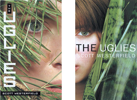
While working on Specials today, I was poking around in my Uglies folder and discovered this pairing:

These were the two covers first given to me by Simon and Schuster, who were good enough to ask my opinion. Like design departments everywhere, the artists misspelled my name, and also managed to get the title wrong. (It’s Uglies, people, not The Uglies.) And let’s not mention the coffee stains.

They’re both really good designs, though. But Justine and I, and everyone else we showed them to, prefered the one on the right. More importantly, S&S agreed, and used that as the basis for the final cover.

So why is it better?

Well, first the leftmost design: The expression is much more intense, like someone secretly watching a terrifying ritual unfold. The lines of grass across the face create a more interesting composition. On the other hand, I don’t like the squarish font of the title as much. And I don’t like the black boxes around my name, which remind me of those machines that insane people use to make sticky labels to put on everything. In trying to make the text readable, the cover winds up with one too many design features.

The one on the right succeeds by being simpler, more direct. Although the eye is smaller, its gaze isn’t muddled up by the foliage. The rounded sans-serif font (without sticky label backing) helps simplify, intensify, and focus the cover. (I also like the black/white treatment of the title, except that it wasn’t the title.) Instead of the terror of the rejected cover, we have something intimate and quietly intriguing.

So simple seems better to me. And I’m glad the final cover zoomed in even closer to the model’s face.

But what the hell do I know? I’m, like, a writer. What do you guys think?

Die Uglies

No, not Die as in “Cease to Live!” Die as in “The.”

That’s right, Uglies is soon to be translated into German.

The publishing company is currently deciding between two titles for this edition. Perhaps they’ll use the more faithful translation Die Haßlichen, meaning simply “The Uglies.” But there has been talk of going with a more descriptive title, such as Die Haßlichenweglaufenzugesichtersparenkinder. This teutonic mouthful means literally “the ugly away-running to save faces kids.” It should look very imposing on the cover:

(Apparently, the plot of Uglies has been used before in German literature. I mean, they’ve already got one word for the whole concept!)

I also received news today that Italian rights have sold. The Italians, however, have opted to buy only the first two books of the trilogy. It seems their clever spies have overheard my midnight screams as I attempt to finish Specials before leaving for Worldcon. Bastardos!

Despite their caution, I’m very pleased about Italians joining the party. As I explain in detail here, I had a friend in college who used to crack me up with literal translations of Italian movie titles. One day, she explained that the wacky comedy known here as Airplane was called “The Craziest Airplane in the World” in Italy. After learning this, my friends and I spent the next four years refering to all movies using this template. Thus:

The Godfather became “The Craziest Family in the World.”
Jaws: “The Craziest Fish in the World.”
All the President’s Men: “The Craziest Quaker in the World.”

Now that I will finally have my own work in Italian, I’m going to insist on title approval in the contract. So which do you think I should go with:
“The Craziest Facial in the World”
“The Craziest Cosmetic Dystopia in the World”
“The Craziest Hoverboards in the World”
“The Craziest Ugly Away-Running to Save Faces Kids in the World” . . . ?

Okay, me stop now. (Any more suggestions?)

Anyway, these two sales makes the Uglies trilogy my most translated work, beating Risen Empire by one language. Go Simon & Schuster foreign rights department!

(And special thanks to niece Renee for helping with the German.)

The Future of Pretty 2

Get ready for some scary, fresh from Boing Boing.

My book Uglies is set in a future in which readily available cosmetic surgery has lead to an “arms race” of attractiveness. Everyone is forced to have huge eyes, super-clear skin, full lips, and all the other signs of neotony that evolution (supposedly) makes us look for when choosing a mate.

But what never occured to me until today is that you don’t need a lot of surgical technology to create this dystopia. All you need is . . . Photoshop.

Behold the world of Angels with Attitude:

From the contest rules:
These photos will be judged on facial beauty, expression & fashion, and overall appeal . . . but should not be extremely or overly retouched. (We are judging the child – not the retoucher!) Overall Winner will receive 50.00 Angel Dollars.

“Angel dollars?” you make ask.

Well, “angel dollars” are just like real dollars, except you can only spend them to enter certain teen and pre-teen beauty contests. These contests are run by the same people who run this “not overly retouched” photo contest. It all fits hand in glove, from digital camera to computer screen to real-life angelic beauty smackdown.

By “angelic,” interestingly, these folks seem to using the same criteria as my Uglies dystopians: creepily huge eyes, clear skin, full lips. But what’s amazing to me about these photos (go gaze at them, if you dare) is that they show how a small group of people can go into a feedback loop and wind up off their collective rockers. This site is not a satire. Nor is this one. This is nothing less than an honestly held aesthetic about what human children should look like.

Can you imagine what will happen when cheap cosmetic surgery is safe and reversible enough for little kids? These won’t just be photos anymore.

Of course, maybe “angelic” is the right word. I mean, angels in the Christian Bible were actually terrible to look upon, right? (Jud 13:6, anyone?) But the word that comes to my mind when I look at these pictures isn’t “terrible.”

It’s more like . . . “eww.”

Bungee Jacket Alert!

Readers of Uglies will know all about my so-called “bungee jackets.” Basically, they’re a futuristic way of escaping a burning building in a magnetic levitation harness. Of course, my tricky uglies and drunken pretties tend to put bungee jackets to much more amusing uses.

Well, it wouldn’t be the future if someone wasn’t already working on it. Howard Price of the Trades (which gave Uglies a great review for my birthday) pointed me to this article in the Economist. It’s about a backpack-based inflatable device that allows you to jump safely from a building and bounce to a halt.

The Lavochkin Association in Moscow demonstrated this device (using a 1/6-scale model) at the Paris Air Show in mid-June. They don’t have a working prototype, but the overall concept seems sound, or at least better than burning to death. (Or jumping with, say, nothing.)

You leap with the backpack on, pulling the cord, and the outer rim inflates as you fall. The aerodynamic shape of the device turns the point downward (putting you on the top) and slows your fall way down. Hopefully the pointy front end is soft enough to protect you from the ground, and any earlier jumpers from you.

The full-size version is six meters (20 feet) across, so imagine a flock of them coming down the street at you on a windy day!

Anyway, I want one. (After the testing. Lots and lots of testing.)